
Chapter 3: Advanced Manipulation on Time Series#
Time series data captures sequential information over consistent time intervals. However, for an effective analysis and modeling, further preprocessing techniques and special type of operations are often applied. Some of the insights one can gain from those operations include stabilizing the mean of a series, smoothening the dynamics of the series, reducing noise and highlighting underlying trends just to name a few.
Practical use cases for these operations are critical when working on forecasting stock prices for instance, analyzing weather patterns, predicting customer demand, and detecting anomalies in sensor data. By mastering these operations, you can gain valuable insights into temporal patterns, identify meaningful trends, and make informed decisions based on historical data.
Learning Objectives:
In this section, you will gain a comprehensive understanding of time series preprocessing techniques including:
Stabilizing the mean of a series through Differentiation operations
Smoothening the series or reducing the noise through rolling mean or moving average
Enriching signal clarity or isolating cyclic patterns within a series through filtering techniques
Reducing the computational complexity through downsampling mechanisms
import pandas as pd
import matplotlib.pyplot as plt
Components of Time Series#
Time series analysis provides a body of techniques to better understand a dataset. Perhaps the most useful of these is the decomposition of a time series into 4 constituent parts:
Level. The baseline value for the series if it were a straight line.
Trend. The optional and often linear increasing or decreasing behavior of the series over time.
Seasonality. The optional repeating patterns or cycles of behavior over time.
Noise. The optional variability in the observations that cannot be explained by the model.
These constituent components can be thought to combine in some way to provide the observed time series. Assumptions can be made about these components both in behavior and in how they are combined, which allows them to be modeled using traditional statistical methods. These components may also be the most effective way to make predictions about future values, but not always. In cases where these classical methods do not result in effective performance, these components may still be useful concepts, and even input to alternate methods.
Example: #
Arusha is a city up north in Tanzania, widely recognized for its several distinctive attributes and significant contributions to both Tanzania and East Africa. Specifically, it holds the distinguished reputation of being Tanzania’s safari capital city and a popular stopover for adventurers who are preparing for a Kilimanjaro expedition. Given the impact of climate change, The Tanzania Tourist Board, which is the national tourism organization, seeks your expertise in examining climate patterns spanning the past three months, from 01 May 2023 to 31st July 2023. This assessment will inform their promotion of tourism activities while considering weather conditions.
What is Arusha sadly known for? Hint: …”Rwanda, August 1993”.
The weather data has been provided by the Tanzania Meteorological Authority(TMA). On an hourly basis, several variables have been measured:
* The Wind Direction at 50 Meters (Degrees)
* The Wind Speed at 50 Meters (m/s)
* The Temperature at 2 Meters (Dregrees Celsius)
* The Precipitation Corrected (mm/hour)
* Specific Humidity at 2 Meters (g/kg)
The data has been shared with you as a csv file called arusha_hourlyseries.csv .
Load it and tell us what you observe just from looking at the column headers.
#if you open the data within a spreadsheet, you will understand why we had to include the skiprows parameter.
arusha_data =  pd.read_csv('data/arusha_hourlyseries.csv' , skiprows=13)
arusha_data.head()
| YEAR | MO | DY | HR | WD50M | T2M | WS50M | PRECTOTCORR | QV2M | |
|---|---|---|---|---|---|---|---|---|---|
| 0 | 2023 | 5 | 1 | 2 | 101.39 | 15.52 | 3.28 | 0.01 | 12.63 |
| 1 | 2023 | 5 | 1 | 3 | 102.74 | 15.33 | 3.26 | 0.01 | 12.57 |
| 2 | 2023 | 5 | 1 | 4 | 108.43 | 15.32 | 3.11 | 0.01 | 12.57 |
| 3 | 2023 | 5 | 1 | 5 | 114.32 | 15.38 | 3.21 | 0.01 | 12.63 |
| 4 | 2023 | 5 | 1 | 6 | 117.97 | 17.37 | 3.41 | 0.01 | 13.37 |
arusha_data.info()
<class 'pandas.core.frame.DataFrame'>
RangeIndex: 2208 entries, 0 to 2207
Data columns (total 9 columns):
 #   Column       Non-Null Count  Dtype
---  ------       --------------  -----
 0   YEAR         2208 non-null   int64
 1   MO           2208 non-null   int64
 2   DY           2208 non-null   int64
 3   HR           2208 non-null   int64
 4   WD50M        2208 non-null   float64
 5   T2M          2208 non-null   float64
 6   WS50M        2208 non-null   float64
 7   PRECTOTCORR  2208 non-null   float64
 8   QV2M         2208 non-null   float64
dtypes: float64(5), int64(4)
memory usage: 155.4 KB
We noticed that the YEAR, MONTH and DAY column are all displayed separately. We might to re-assemble them into a date column with the correspond data type. Prior to do that, let’s rename those columbs appropriately.
arusha_data.columns = ['year' , 'month' , 'day' , 'hour' ,
                       'WD50M', 'T2M', 'WS50M', 'PRECTOTCORR','QV2M' ]
arusha_data.head(3)
| year | month | day | hour | WD50M | T2M | WS50M | PRECTOTCORR | QV2M | |
|---|---|---|---|---|---|---|---|---|---|
| 0 | 2023 | 5 | 1 | 2 | 101.39 | 15.52 | 3.28 | 0.01 | 12.63 |
| 1 | 2023 | 5 | 1 | 3 | 102.74 | 15.33 | 3.26 | 0.01 | 12.57 |
| 2 | 2023 | 5 | 1 | 4 | 108.43 | 15.32 | 3.11 | 0.01 | 12.57 |
arusha_data['Date'] = pd.to_datetime(arusha_data[["year", "month", "day"]])
arusha_data =  arusha_data[['Date']+ list(arusha_data.columns[:-1])]
arusha_data.head()
| Date | year | month | day | hour | WD50M | T2M | WS50M | PRECTOTCORR | QV2M | |
|---|---|---|---|---|---|---|---|---|---|---|
| 0 | 2023-05-01 | 2023 | 5 | 1 | 2 | 101.39 | 15.52 | 3.28 | 0.01 | 12.63 |
| 1 | 2023-05-01 | 2023 | 5 | 1 | 3 | 102.74 | 15.33 | 3.26 | 0.01 | 12.57 |
| 2 | 2023-05-01 | 2023 | 5 | 1 | 4 | 108.43 | 15.32 | 3.11 | 0.01 | 12.57 |
| 3 | 2023-05-01 | 2023 | 5 | 1 | 5 | 114.32 | 15.38 | 3.21 | 0.01 | 12.63 |
| 4 | 2023-05-01 | 2023 | 5 | 1 | 6 | 117.97 | 17.37 | 3.41 | 0.01 | 13.37 |
The same applies to the hours column. But here, we convert the integer representation into an hour column.
arusha_data['hour'] = pd.to_datetime(arusha_data['hour'], unit='h').dt.time
arusha_data.head(3)
| Date | year | month | day | hour | WD50M | T2M | WS50M | PRECTOTCORR | QV2M | |
|---|---|---|---|---|---|---|---|---|---|---|
| 0 | 2023-05-01 | 2023 | 5 | 1 | 02:00:00 | 101.39 | 15.52 | 3.28 | 0.01 | 12.63 |
| 1 | 2023-05-01 | 2023 | 5 | 1 | 03:00:00 | 102.74 | 15.33 | 3.26 | 0.01 | 12.57 |
| 2 | 2023-05-01 | 2023 | 5 | 1 | 04:00:00 | 108.43 | 15.32 | 3.11 | 0.01 | 12.57 |
arusha_data.info()
<class 'pandas.core.frame.DataFrame'>
RangeIndex: 2208 entries, 0 to 2207
Data columns (total 10 columns):
 #   Column       Non-Null Count  Dtype
---  ------       --------------  -----
 0   Date         2208 non-null   datetime64[ns]
 1   year         2208 non-null   int64
 2   month        2208 non-null   int64
 3   day          2208 non-null   int64
 4   hour         2208 non-null   object
 5   WD50M        2208 non-null   float64
 6   T2M          2208 non-null   float64
 7   WS50M        2208 non-null   float64
 8   PRECTOTCORR  2208 non-null   float64
 9   QV2M         2208 non-null   float64
dtypes: datetime64[ns](1), float64(5), int64(3), object(1)
memory usage: 172.6+ KB
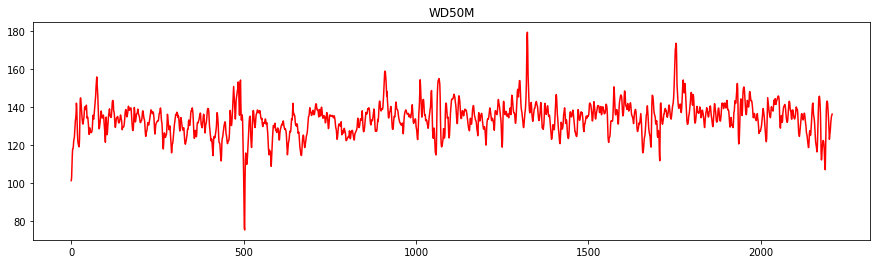
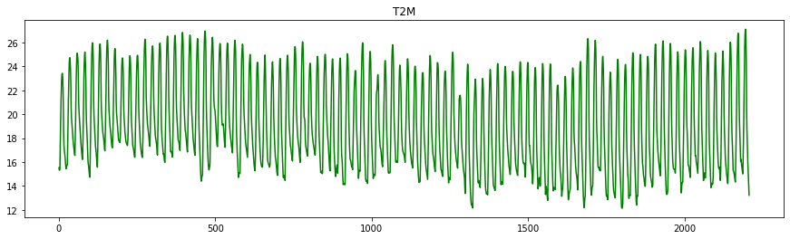
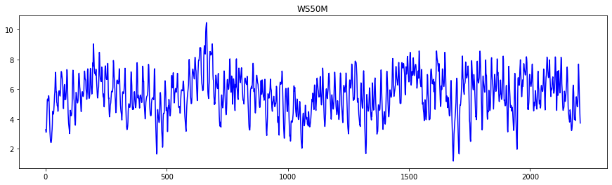
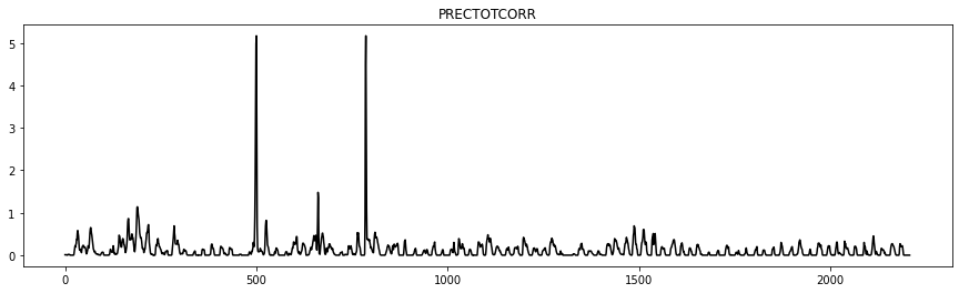
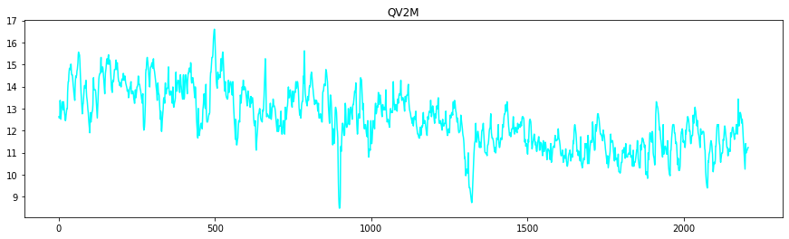
Let’s look at the tendancy for each of the variables
import matplotlib.pyplot as plt
colors = ['r' , 'g' , 'b' , 'k' , 'cyan']
for var , col  in zip(arusha_data.columns[5:] ,colors):
    plt.figure(figsize=(15,4))
    plt.plot(arusha_data[var] ,  color=col)
    plt.title(var)
To get the flavour of the series, we might also want to investigate the start date and the end data of the series.
arusha_data["Date"].min()
Timestamp('2023-05-01 00:00:00')
arusha_data["Date"].max()
Timestamp('2023-08-01 00:00:00')
We could see that the data collection started on 01st May 2023 and ended on 01st August 2023 at midnight.
Differencing time series#
Differencing is a method of transforming a time series dataset. It can be used to remove the series dependence on time, so-called temporal dependence. This includes structures like trends and seasonality. Taking the difference between consecutive observations is called a lag-1 difference. The lag difference can be adjusted to suit the specific temporal structure. you can use the .diff() method to perform that.
Let’s say we are interested in knowing the temperature difference between two consecutive days within the series.
arusha_data['T2M'].head()
0    15.52
1    15.33
2    15.32
3    15.38
4    17.37
Name: T2M, dtype: float64
arusha_data["Temp_diff"] = arusha_data["T2M"].diff()
arusha_data[['Date' , 'T2M', 'Temp_diff']].head(10)
| Date | T2M | Temp_diff | |
|---|---|---|---|
| 0 | 2023-05-01 | 15.52 | NaN |
| 1 | 2023-05-01 | 15.33 | -0.19 |
| 2 | 2023-05-01 | 15.32 | -0.01 |
| 3 | 2023-05-01 | 15.38 | 0.06 |
| 4 | 2023-05-01 | 17.37 | 1.99 |
| 5 | 2023-05-01 | 18.80 | 1.43 |
| 6 | 2023-05-01 | 20.22 | 1.42 |
| 7 | 2023-05-01 | 21.46 | 1.24 |
| 8 | 2023-05-01 | 22.47 | 1.01 |
| 9 | 2023-05-01 | 23.12 | 0.65 |
As you could notice, the first entry of the Temperature difference column has NaN as a placeholder as it refers the starting date, which means there is no value to differentiate against.
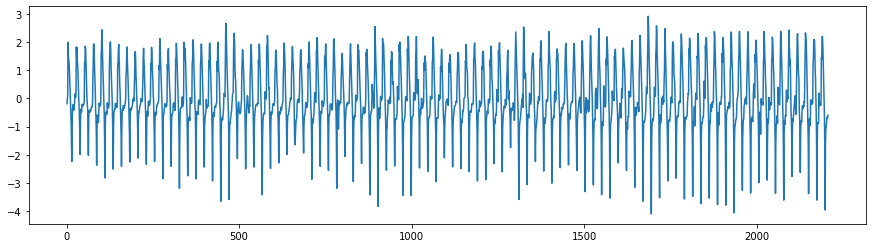
The differentiation becomes useful when we are concerned about removing the linear trend from the dynamics of the series. Let’s see how the temperature difference looks like.
plt.figure(figsize=(15,4))
plt.plot(arusha_data['Temp_diff'])
[<matplotlib.lines.Line2D at 0x7fc44280a130>]
One could also change the lag difference in order to adress a specific temporal structure. By passing an integer parameter to the .diff() method, we can compute the difference between two timely distant observations of the variable. For instance, the temperature difference every two hours, will be computed the following way:
arusha_data["T2M"].diff(2)
0        NaN
1        NaN
2      -0.20
3       0.05
4       2.05
        ...
2203   -1.90
2204   -1.58
2205   -1.37
2206   -1.35
2207   -1.29
Name: T2M, Length: 2208, dtype: float64
Cumulating time series#
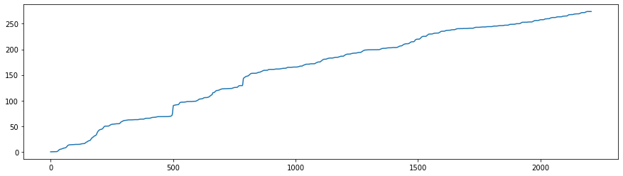
As opposed to differencing, we might be concerned with tracking the accumulated total of a variable over time, in order to understand the growth patterns, comparing year-to-date figures or observing the accumulation rate of a particular metric.
For the case in hand, it won’t make a lot of sense to compute the accumulated temperature over hours/days, as temperature is an intensive physical property of matter that is not additive. However, computing the accumulated precipitation over some time period could tell us about the pluviometry of that location or the total amount of rainfall within a specific time frame within that location.
arusha_data["Prec_cum"] = arusha_data["PRECTOTCORR"].cumsum()
arusha_data[['Date' , 'PRECTOTCORR', 'Prec_cum']].head(10)
arusha_data.head()
| Date | year | month | day | hour | WD50M | T2M | WS50M | PRECTOTCORR | QV2M | Temp_diff | Prec_cum | |
|---|---|---|---|---|---|---|---|---|---|---|---|---|
| 0 | 2023-05-01 | 2023 | 5 | 1 | 02:00:00 | 101.39 | 15.52 | 3.28 | 0.01 | 12.63 | NaN | 0.01 |
| 1 | 2023-05-01 | 2023 | 5 | 1 | 03:00:00 | 102.74 | 15.33 | 3.26 | 0.01 | 12.57 | -0.19 | 0.02 |
| 2 | 2023-05-01 | 2023 | 5 | 1 | 04:00:00 | 108.43 | 15.32 | 3.11 | 0.01 | 12.57 | -0.01 | 0.03 |
| 3 | 2023-05-01 | 2023 | 5 | 1 | 05:00:00 | 114.32 | 15.38 | 3.21 | 0.01 | 12.63 | 0.06 | 0.04 |
| 4 | 2023-05-01 | 2023 | 5 | 1 | 06:00:00 | 117.97 | 17.37 | 3.41 | 0.01 | 13.37 | 1.99 | 0.05 |
plt.figure(figsize=(15,4))
plt.plot(arusha_data['Prec_cum'])
[<matplotlib.lines.Line2D at 0x7fc444887ca0>]
arusha_data[arusha_data['month'] == 5].tail()
| Date | year | month | day | hour | WD50M | T2M | WS50M | PRECTOTCORR | QV2M | Temp_diff | Prec_cum | |
|---|---|---|---|---|---|---|---|---|---|---|---|---|
| 737 | 2023-05-31 | 2023 | 5 | 31 | 19:00:00 | 131.80 | 18.79 | 7.23 | 0.01 | 13.49 | -0.47 | 123.61 |
| 738 | 2023-05-31 | 2023 | 5 | 31 | 20:00:00 | 132.09 | 18.33 | 7.07 | 0.01 | 13.49 | -0.46 | 123.62 |
| 739 | 2023-05-31 | 2023 | 5 | 31 | 21:00:00 | 134.02 | 17.80 | 6.43 | 0.03 | 13.61 | -0.53 | 123.65 |
| 740 | 2023-05-31 | 2023 | 5 | 31 | 22:00:00 | 135.38 | 17.39 | 5.80 | 0.15 | 13.79 | -0.41 | 123.80 |
| 741 | 2023-05-31 | 2023 | 5 | 31 | 23:00:00 | 137.22 | 17.30 | 5.43 | 0.22 | 13.85 | -0.09 | 124.02 |
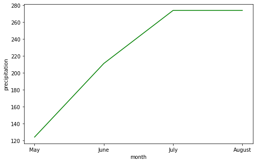
This could in turn answer questions related to the monthly total amount of rainfall in arusha and we could also observe its dynamics.
monthly_Tot_rfall = arusha_data.groupby('month')['Prec_cum'].last()
monthly_Tot_rfall
month
5    124.02
6    211.12
7    273.85
8    273.85
Name: Prec_cum, dtype: float64
plt.figure(figsize=(8,5))
plt.plot(['May' , 'June', 'July' , 'August'] , monthly_Tot_rfall ,'g')
plt.ylabel('precipitation')
plt.xlabel('month')
# plt.title('Monthly Total amount of rainfall')
Text(0.5, 0, 'month')
Rolling Mean#
While the daily or hourly temperature fluctuations can be quite erratic due to various transient factors, we might be interested in identifying any longer-term trends or anomalies that might suggest broader climatic shifts. The rolling mean (often referred to as the moving average) is a powerful tool to tackle that issue.
By applying a rolling mean with a fixed window size, we can smooth out the day-to-day fluctuations and clearly see monthly patterns. For instance, let’s look at the moving average given a windown of fixed size 12, in order to tell how the data behaves on a 12hours basis.
We can use the .rolling() method, which takes a parameter of the number of values to consider in the rolling window. In the example below, we take the mean of six values, in order to have the moving average every six consecutive hours of the day.
arusha_data['rolling_6h_mean'] = arusha_data['T2M'].rolling( window= 6).mean()
arusha_data[['Date' , 'T2M' , 'rolling_6h_mean']]
| Date | T2M | rolling_6h_mean | |
|---|---|---|---|
| 0 | 2023-05-01 | 15.52 | NaN |
| 1 | 2023-05-01 | 15.33 | NaN |
| 2 | 2023-05-01 | 15.32 | NaN |
| 3 | 2023-05-01 | 15.38 | NaN |
| 4 | 2023-05-01 | 17.37 | NaN |
| ... | ... | ... | ... |
| 2203 | 2023-07-31 | 15.89 | 19.021667 |
| 2204 | 2023-07-31 | 15.18 | 17.485000 |
| 2205 | 2023-07-31 | 14.52 | 16.498333 |
| 2206 | 2023-08-01 | 13.83 | 15.661667 |
| 2207 | 2023-08-01 | 13.23 | 14.901667 |
2208 rows × 3 columns
Resampling the Time Series#
There are several scenarios where one might need to resample the time series, which is a fundamental step in time series analysis. Resampling time series data refers to the process of changing the time-frequency or granularity of the data points. This can be either an increase in frequency (upsampling) or a reduction (downsampling). By adapting the frequency, analysts can align datasets with different intervals for consistent comparisons or analyses.
Downsampling the Time Series#
Downsampling the series, which involves reducing the data’s granularity, is particularly useful in improving computational efficiency, reducing noise and providing a higher-level view of patterns or trends.
Improving Computation Efficiency:
For very large datasets, computation can become resource-intensive and time-consuming. Downsampling can make data processing and modeling more manageable.
Noise Reduction:
High-frequency data can sometimes introduce a lot of noise. Downsampling, when combined with aggregation (like taking the mean), can help in smoothening the data and removing short-term fluctuations or noise, revealing longer-term trends or cycles.
Visualizations:
Too many data points can make visualizations cluttered and less informative. Downsampling can make plots and charts clearer and easier to understand.
A practical example would be to convert hourly data to daily data or daily data to monthtly or to any frequency that is dictated by the problem. For instance, let’s look at the distribution of the wind speed on a day to day basis.
plt.figure(figsize=(25, 10))
for day   in range(12):
        ax =  plt.subplot(4,3, day+1)
        plt.plot(arusha_data['WS50M'].values[24*day:24*(day+1)])
        #plt.xlabel('hour')
        plt.ylabel('wind speed')
        #plt.title('day ' +str(day+1))
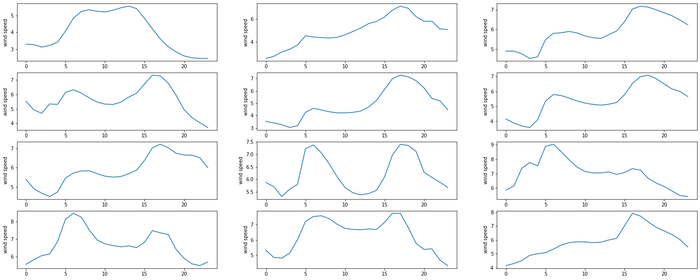
Despite the wind’s overall daily fluctuations, there may not be a significant change within two consecutive hours. This suggests that if we encounter one of the aforementioned situations, we could downsample the wind speed signal by recording it every two hours. Consequently, there would be twelve data points in a day instead of twenty-four.
It is achieving by doing the following:
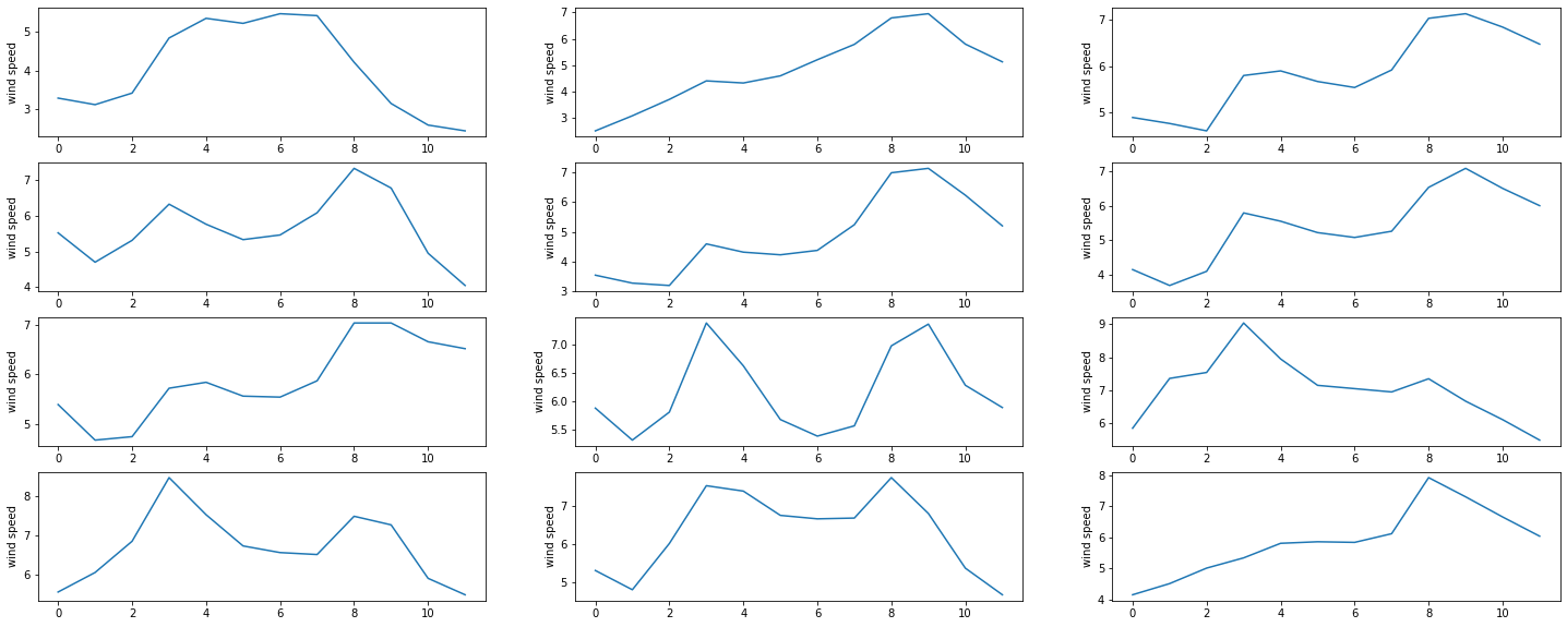
arusha_per2h = arusha_data[::2]
Below is the resulting daily plots of wind speed
plt.figure(figsize=(25, 10))
for day   in range(12):
        ax =  plt.subplot(4,3, day+1)
        plt.plot(arusha_per2h['WS50M'].values[12*day:12*(day+1)])
        #plt.xlabel('hour')
        plt.ylabel('wind speed')
Another downsampling strategy involves reducing the frequency of data points, by computing an aggregate of a certain time interval. For instance, in case of low variation of the signals, we might consider only working with daily averages, which means that the 24 data points available within a day are therefore represented by their average value. To work that out effectively with dataframes, we would have to set the date column as dataframe index.
arusha_indexed= arusha_data.set_index(["Date"])
arusha_indexed.head(5)
| year | month | day | hour | WD50M | T2M | WS50M | PRECTOTCORR | QV2M | Temp_diff | Prec_cum | rolling_6h_mean | |
|---|---|---|---|---|---|---|---|---|---|---|---|---|
| Date | ||||||||||||
| 2023-05-01 | 2023 | 5 | 1 | 02:00:00 | 101.39 | 15.52 | 3.28 | 0.01 | 12.63 | NaN | 0.01 | NaN |
| 2023-05-01 | 2023 | 5 | 1 | 03:00:00 | 102.74 | 15.33 | 3.26 | 0.01 | 12.57 | -0.19 | 0.02 | NaN |
| 2023-05-01 | 2023 | 5 | 1 | 04:00:00 | 108.43 | 15.32 | 3.11 | 0.01 | 12.57 | -0.01 | 0.03 | NaN |
| 2023-05-01 | 2023 | 5 | 1 | 05:00:00 | 114.32 | 15.38 | 3.21 | 0.01 | 12.63 | 0.06 | 0.04 | NaN |
| 2023-05-01 | 2023 | 5 | 1 | 06:00:00 | 117.97 | 17.37 | 3.41 | 0.01 | 13.37 | 1.99 | 0.05 | NaN |
And then, we can take the daily mean of the observations and see the corresponding plot
arusha_dsp1 = pd.DataFrame(arusha_indexed.resample("D")['T2M','WS50M' ].mean())#.reset_index()
arusha_dsp1.head(10)
| T2M | WS50M | |
|---|---|---|
| Date | ||
| 2023-05-01 | 18.923636 | 4.167273 |
| 2023-05-02 | 19.774167 | 4.715833 |
| 2023-05-03 | 20.421250 | 5.811250 |
| 2023-05-04 | 19.747917 | 5.817917 |
| 2023-05-05 | 19.861667 | 4.783750 |
| 2023-05-06 | 20.297917 | 5.357500 |
| 2023-05-07 | 20.902917 | 5.846250 |
| 2023-05-08 | 20.593333 | 6.253333 |
| 2023-05-09 | 20.295417 | 7.083750 |
| 2023-05-10 | 19.993750 | 6.689167 |
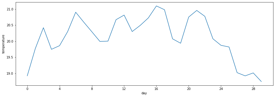
Below we have the daily average of temperature over the course of a month.
import matplotlib
days =  ['day' + str(i+1) for i in range(30)]
plt.figure(figsize=(15,5))
plt.plot(days, arusha_dsp1['T2M'].head(30))
plt.xlabel('day')
plt.ylabel('temperature')
locator = matplotlib.ticker.MultipleLocator(4)
plt.gca().xaxis.set_major_locator(locator)
formatter = matplotlib.ticker.StrMethodFormatter("{x:.0f}")
plt.gca().xaxis.set_major_formatter(formatter)
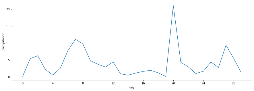
Below we have the daily sum of precipitation over the course of a month.
arusha_dsp2 = pd.DataFrame(arusha_indexed.resample("D")['PRECTOTCORR','QV2M' ].sum())#.reset_index()
arusha_dsp2
| PRECTOTCORR | QV2M | |
|---|---|---|
| Date | ||
| 2023-05-01 | 0.15 | 283.68 |
| 2023-05-02 | 5.40 | 338.50 |
| 2023-05-03 | 6.25 | 349.43 |
| 2023-05-04 | 2.23 | 325.38 |
| 2023-05-05 | 0.50 | 312.78 |
| ... | ... | ... |
| 2023-07-28 | 2.85 | 274.87 |
| 2023-07-29 | 1.17 | 275.32 |
| 2023-07-30 | 2.71 | 291.69 |
| 2023-07-31 | 1.85 | 278.02 |
| 2023-08-01 | 0.00 | 22.46 |
93 rows × 2 columns
days =  ['day' + str(i+1) for i in range(30)]
plt.figure(figsize=(15,5))
plt.plot(days, arusha_dsp2['PRECTOTCORR'].head(30))
plt.xlabel('day')
plt.ylabel('precipitation')
locator = matplotlib.ticker.MultipleLocator(4)
plt.gca().xaxis.set_major_locator(locator)
formatter = matplotlib.ticker.StrMethodFormatter("{x:.0f}")
plt.gca().xaxis.set_major_formatter(formatter)
Upsampling the Time Series#
On the other hand, upsampling increases the granularity, which can be beneficial for filling gaps in data or preparing data for certain models or applications that require a specific frequency. When resampling, the choice of method for filling or aggregating values—such as linear interpolation, mean, or sum—is crucial to ensure meaningful and accurate representation.
Upsampling is when the frequency of samples is increased (e.g., months to days).
Again, you can use the
.resample()
method.
Let’s consider the downsamples, we could choose the downsampled temperature data that we performed earlier and try and resample it using the linear interpolation.
arusha_dsp1
| T2M | WS50M | |
|---|---|---|
| Date | ||
| 2023-05-01 | 18.923636 | 4.167273 |
| 2023-05-02 | 19.774167 | 4.715833 |
| 2023-05-03 | 20.421250 | 5.811250 |
| 2023-05-04 | 19.747917 | 5.817917 |
| 2023-05-05 | 19.861667 | 4.783750 |
| ... | ... | ... |
| 2023-07-28 | 18.828750 | 6.531250 |
| 2023-07-29 | 18.892500 | 5.645833 |
| 2023-07-30 | 19.415000 | 4.417500 |
| 2023-07-31 | 19.561250 | 5.175000 |
| 2023-08-01 | 13.530000 | 3.935000 |
93 rows × 2 columns
arusha_intdaily = arusha_dsp1.resample("H").interpolate(method = "linear")
arusha_intdaily
| T2M | WS50M | |
|---|---|---|
| Date | ||
| 2023-05-01 00:00:00 | 18.923636 | 4.167273 |
| 2023-05-01 01:00:00 | 18.959075 | 4.190129 |
| 2023-05-01 02:00:00 | 18.994514 | 4.212986 |
| 2023-05-01 03:00:00 | 19.029953 | 4.235843 |
| 2023-05-01 04:00:00 | 19.065391 | 4.258699 |
| ... | ... | ... |
| 2023-07-31 20:00:00 | 14.535208 | 4.141667 |
| 2023-07-31 21:00:00 | 14.283906 | 4.090000 |
| 2023-07-31 22:00:00 | 14.032604 | 4.038333 |
| 2023-07-31 23:00:00 | 13.781302 | 3.986667 |
| 2023-08-01 00:00:00 | 13.530000 | 3.935000 |
2209 rows × 2 columns
plt.figure(figsize=(25, 10))
for day   in range(12):
        ax =  plt.subplot(4,3, day+1)
        plt.plot(arusha_data['WS50M'].values[24*day:24*(day+1)] ,label = 'true data')
        plt.plot(arusha_intdaily['WS50M'].values[24*day:24*(day+1)],label = 'intpd data')
        plt.ylabel('wind speed')
        plt.legend()
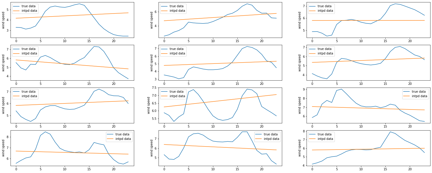
We can see that the linear interpolation is not the best representation of our observations. One should probably think of an polynomial interpolation and choose an convenient degree for the polynomial.
Task 4: #
SahelPower Co. is an energy company located in Moundou, the second largest city in Chad. They primarily relies on wind farms to generate electricity. The company understands that electricity demand is influenced by various factors, including ambient temperature as in hot weather, households tend to consume more energy.
However, their wind power generation platform is ran by a subisidiary start-up specialized in wind powerplants constructions called SaoWind. SaoWind provide wind-related data, and SahelPower Co. has the technology to convert it into wind energy for electricity usage.
Their overall goal is to optimize their electricity production, manage demand-supply gaps, and improve overall efficiency through analyzing closely the datasets they have received from both SNE (Societe Nationale d’Electricite du Tchad) and SaoWind (wind speed and direction).
Here are a few additional information regarding the data files they have received:
SaoWind:
Variables: Wind speed at 50M , Wind Direction at 50M
Resolution: hourly observations
Date range: 01 Jan 2004 at 10AM - 26 Feb 2004 at 9AM
file name:
saowind_data.csv
SNE
Variables: Electricity demand, Ambiant Temperature
Resolution: hourly observations
Date range: 01 Jan 2004 at 00AM - 26 Feb 2004 at 11PM
file name:
snelec_data.csv
Wind is often considered as one of the cleanest form of renewable energy? What are the pros and cons of it?
You have noticed that data came from two different sheets. Merge them and report on the different steps you used to achieve that.
Plot the temperature and demand seperately and comment on the plots
How do the average electricity demand and the ambient temperature vary across different weeks? Commenton your findings.
On days when the ambient temperature was above 25°C, was the electricity demand significantly higher than on days when it was below 25°C?
Plot the temperature differences between Saturday withing the observations.
How does the average electricity generation during daytime hours (e.g., 6 am to 6 pm) compare to the average generation during nighttime hours (e.g., 6 pm to 6 am)?
The WD50M measure the direction of the wind towards the North Direction. However, for wind power calculation, due to the singularity around 0 and 360 degrees, it was decided to convert the wind speed and direction into wind vector (x and y components) using the formula below:
\(w_x = v \cdot \cos(\phi)\)
\( w_y = v \cdot \sin(\phi)\)
where \(v\) is the wind velocity and \(\phi\) is the wind angle. Compute the x and y computer components of the wind vector and plot the corresponding graphs.